AI Scientific Illustration
Software for Researchers
Generate publication-ready scientific illustrations in seconds. Create pathway diagrams, molecular mechanisms, cell biology figures, and lab schematics from plain-language prompts.
Try a sample prompt or write your own
Example scientific illustrations generated from text
What researchers typed → what FigCanvas generated.
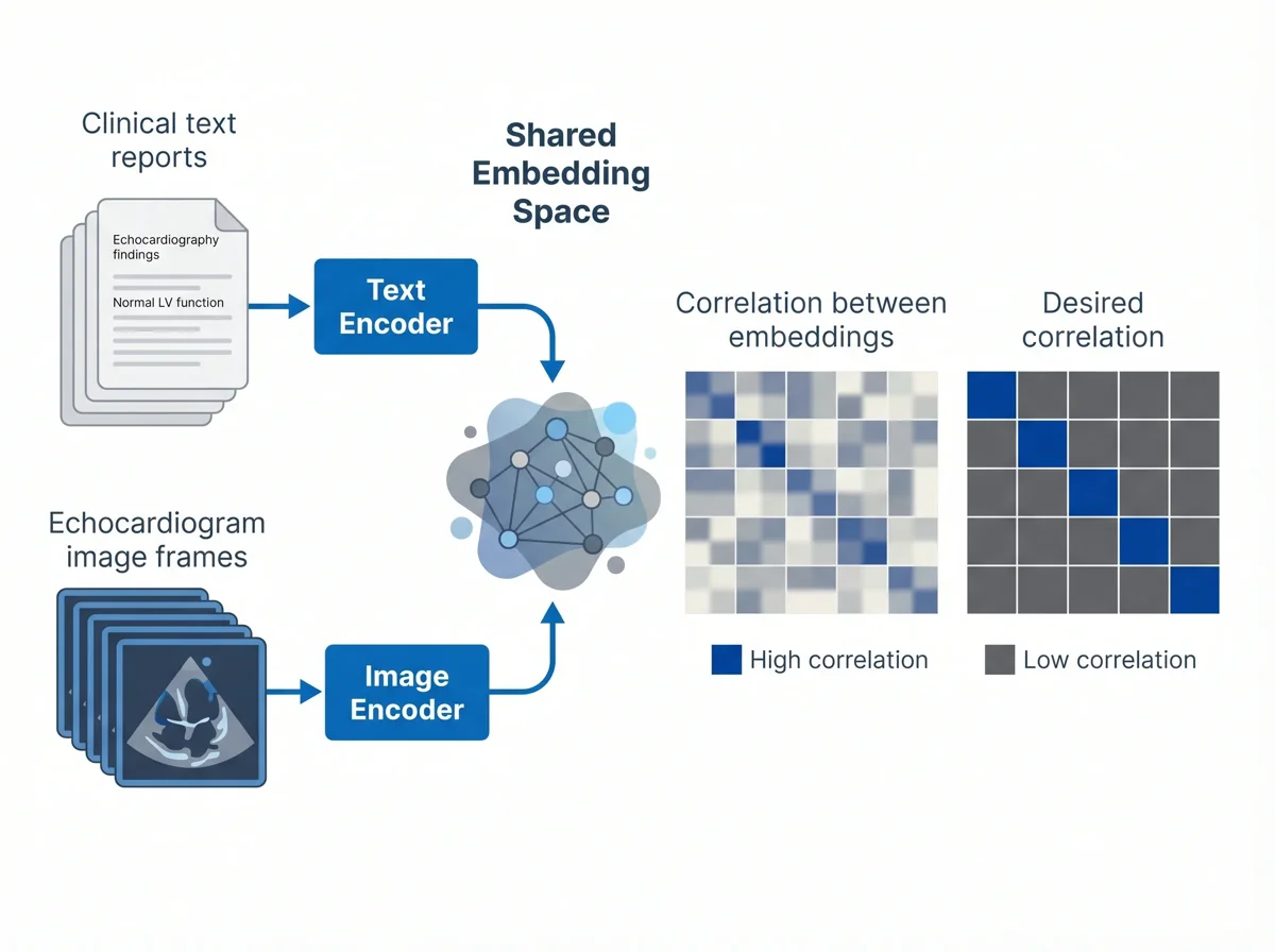
A contrastive learning diagram with two input modalities. One branch takes a stack of clinical text reports (short echocardiography findings) and passes them through a text encoder. The other branch takes a stack of echocardiogram image frames and passes them through an image encoder. Both encoders project into a shared embedding space. On the right, show two 5×5 similarity matrices side by side: the first labeled "Correlation between embeddings" with a fuzzy, imperfect pattern (current training state), the second labeled "Desired correlation" with a sharp, clean diagonal (training target). Style: flat, editorial, Nature-journal aesthetic. Input cards can be stacked to suggest batches. Composition, palette, and typography are up to the agent — prioritise visual clarity and whitespace.
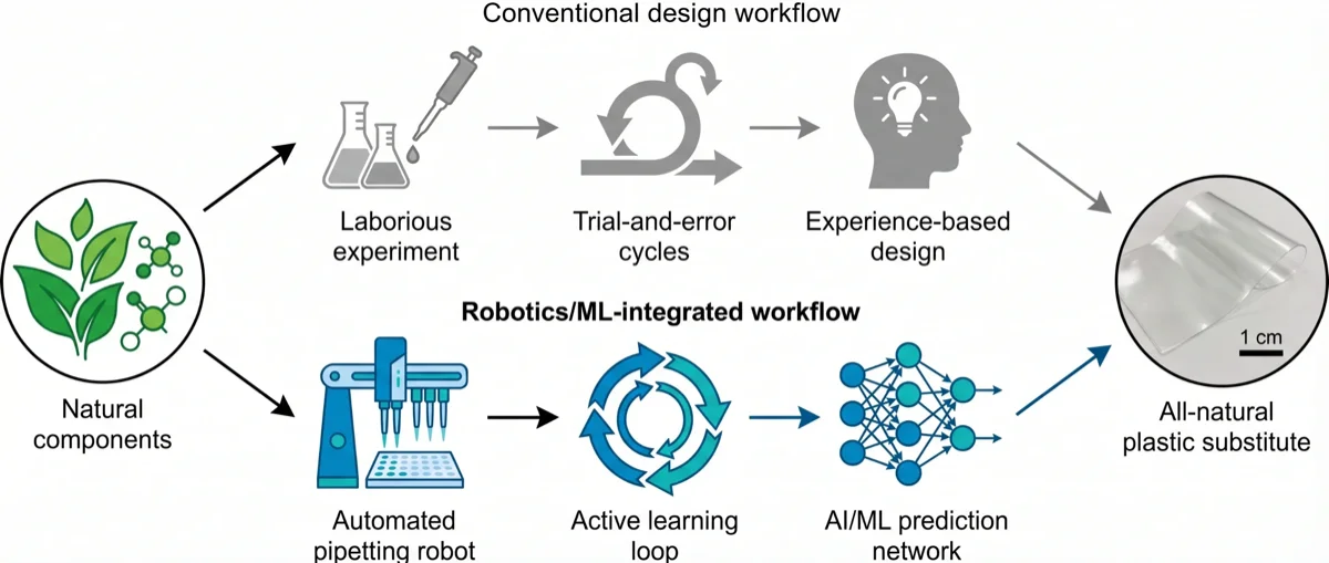
A two-row comparison diagram contrasting a conventional workflow with a robotics-and-ML workflow for discovering a natural-component plastic substitute. On the far left, a single icon labelled "Natural components" shows a cluster of leaves and biomolecules, representing the shared starting point. On the far right, a photograph-style panel shows the final result: an "All-natural plastic substitute" film with a small scale bar. Between the two ends, two parallel horizontal paths run from left to right. The top path, labelled "Conventional design workflow", is rendered greyed out and shows three sequential steps: laborious experiment, trial-and-error cycles, and experience-based design. The bottom path, labelled "Robotics/ML-integrated workflow", is rendered in a bold accent style and shows an automated pipetting robot feeding into an active learning loop (circular arrow), which in turn feeds an AI/ML prediction network. Arrows flow along each path toward the final product. Style: flat, editorial, Nature-journal aesthetic. Composition and palette are up to the agent.
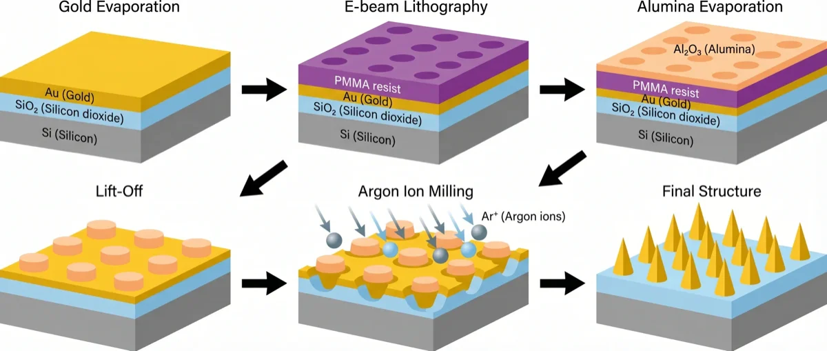
A six-panel process diagram for fabricating a gold nanocone array, arranged as two rows of three panels with arrows threading through them. Each panel shows an isometric cross-section of the same silicon substrate at a different fabrication stage. Panel 1 "Gold Evaporation" shows a Si/SiO2 slab with a uniform Au film on top. Panel 2 "E-beam Lithography" adds a PMMA resist layer with a regular pattern of circular holes. Panel 3 "Alumina Evaporation" adds an Al2O3 layer over the resist, filling the holes. Panel 4 "Lift-Off" removes the resist, leaving an array of Al2O3 discs on the Au film. Panel 5 "Argon Ion Milling" shows argon ions (Ar+) bombarding the surface from above, eroding the Au around each disc. Panel 6 "Final Structure" shows a clean array of pointed gold nanocones on the silicon substrate. Arrows flow from panel 1 to 6. Style: flat, editorial, Nature-journal aesthetic. Composition and palette are up to the agent.
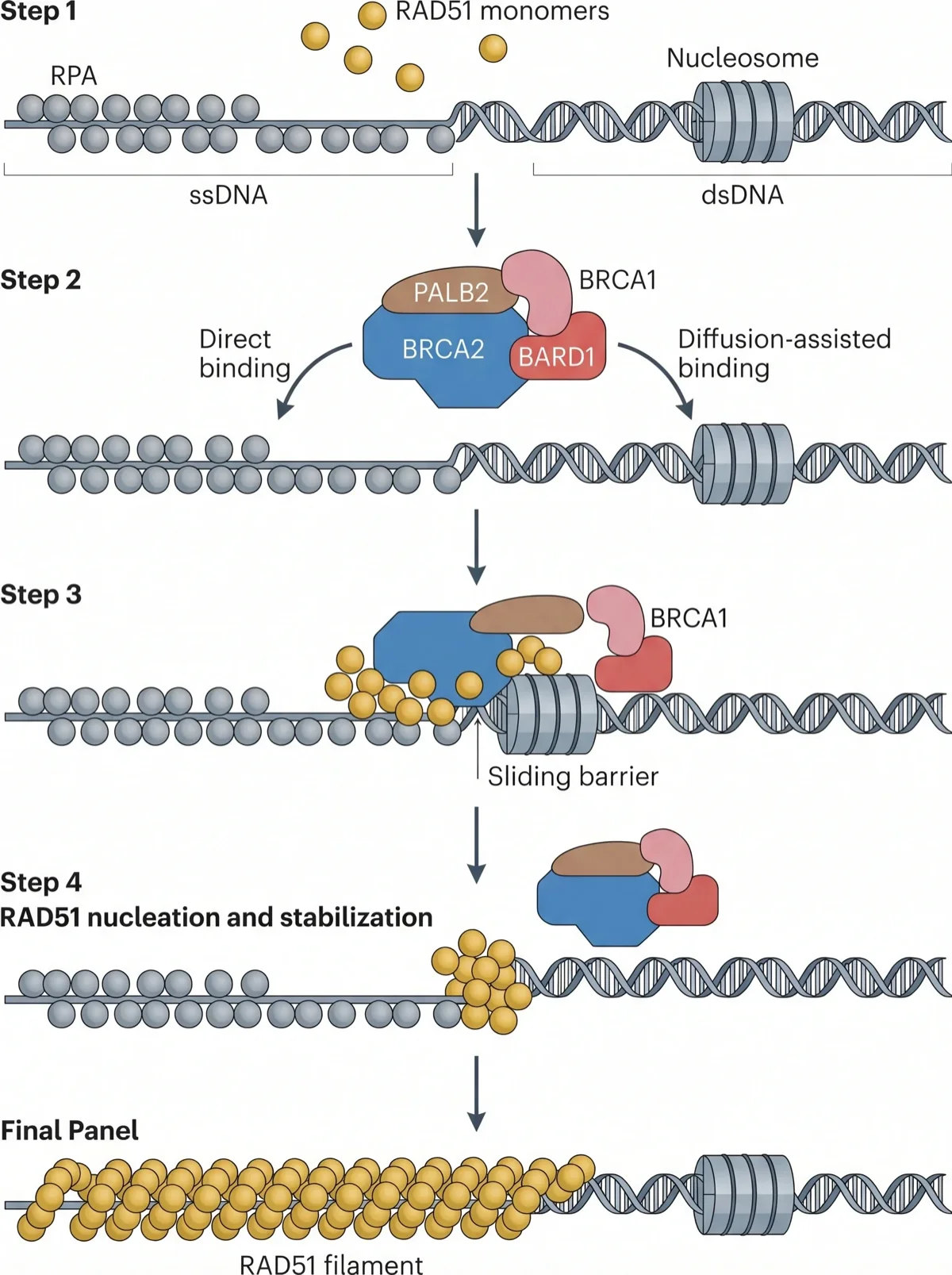
A vertical four-step molecular mechanism showing how BRCA2 loads RAD51 onto damaged DNA. Step 1 shows a long DNA strand with an RPA-coated single-stranded region on the left and a nucleosome-bound double-stranded region on the right; free RAD51 molecules float above. Step 2 shows a BRCA2 complex (with PALB2, BRCA1, BARD1 partners) approaching the DNA in two ways: a curved arrow labelled "direct binding" pointing to the RPA-coated ssDNA, and a second arrow labelled "diffusion-assisted binding" landing on the dsDNA arm. Step 3 shows the BRCA2-RAD51 complex sliding along the dsDNA toward the junction, with a nucleosome acting as a "sliding barrier" that stops it. Step 4 shows "RAD51 nucleation and stabilization": clustered RAD51 monomers at the ssDNA-dsDNA junction. A final panel at the bottom shows a fully extended "RAD51 filament" along the ssDNA. Vertical arrows connect the steps. Style: flat, editorial, Nature-journal aesthetic. Composition and palette are up to the agent.
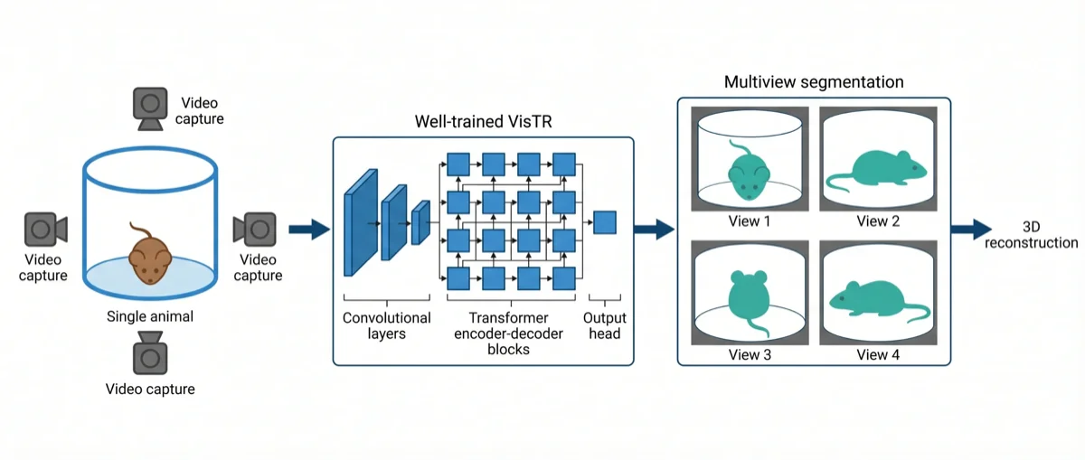
A left-to-right model diagram for multi-view animal segmentation. On the far left, show a cylindrical arena labelled "Single animal" containing a small mouse, surrounded by four camera icons aimed inward to suggest "Video capture". An arrow leads to the middle block labelled "Well-trained VisTR", drawn as a stylised transformer architecture: a stack of convolutional feature layers on the left followed by a grid of transformer encoder-decoder blocks on the right, ending in a small output head. Another arrow leads to the right block labelled "Multiview segmentation", showing a 2x2 grid of four viewpoint crops of the mouse with a teal segmentation mask overlaid on each. A final arrow exits to the right to suggest downstream 3D reconstruction. Style: flat, editorial, Nature-journal aesthetic. Keep the arena, network, and segmentation outputs visually distinct. Composition and palette are up to the agent.
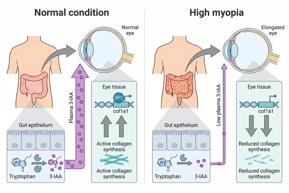
A two-panel mechanism illustration showing how gut-derived tryptophan metabolism influences scleral collagen synthesis in high myopia. On the left, a cartoon human torso highlights the intestine in pink, with an arrow pointing up to a dashed callout containing a pair of eye cross-sections. The left eye shows a normal-length eyeball with upward arrows next to "SP1" and "col1a1" (indicating active SP1 binding to the COL1A1 promoter and strong collagen production, drawn as a DNA helix with a protein icon). The right eye shows an elongated, myopic eyeball with downward arrows next to the same labels, indicating reduced SP1 binding and decreased collagen. Below the eyes, a horizontal band depicts the gut epithelial lining: on the left, tryptophan metabolism produces abundant 3-IAA; on the right, dysbiosis leads to reduced 3-IAA. Vertical arrows connect the gut panel up to the eye panel on each side, showing how plasma 3-IAA drives the sclera phenotype. Style: flat, editorial, Nature-journal aesthetic. Composition and palette are up to the agent.
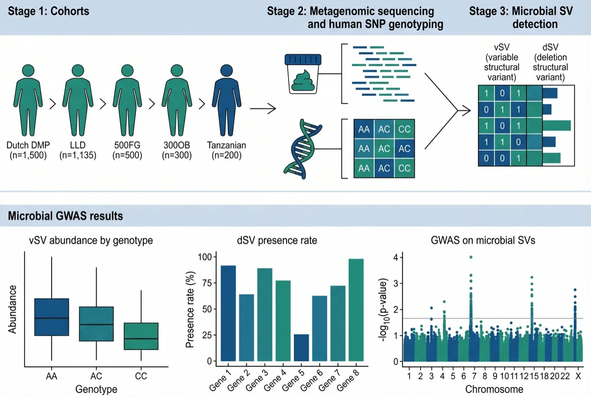
A two-row workflow diagram for a microbiome GWAS study. The top row shows the pipeline left to right in three stages. Stage one "Cohorts" lists four human cohorts (Dutch DMP, LLD, 500FG, 300OB, and a Tanzanian cohort) with small icons and sample sizes. Stage two "Metagenomic sequencing and human SNP genotyping" shows a stool-sample icon feeding into a sequencing reads panel, paired with a DNA-helix icon feeding into a SNP genotyping grid. Stage three "Microbial SV detection" shows a small participant-by-genes matrix with vSV and dSV columns. The bottom row shows three result panels side by side: a boxplot of vSV abundance stratified by human SNP genotype (AA/AC/CC), a bar chart of dSV presence rate by genotype, and a Manhattan plot titled "GWAS on microbial SVs" with chromosomes on the x-axis and log10 p-values on the y-axis. Style: flat, editorial, Nature-journal aesthetic. Composition, palette, and typography are up to the agent.
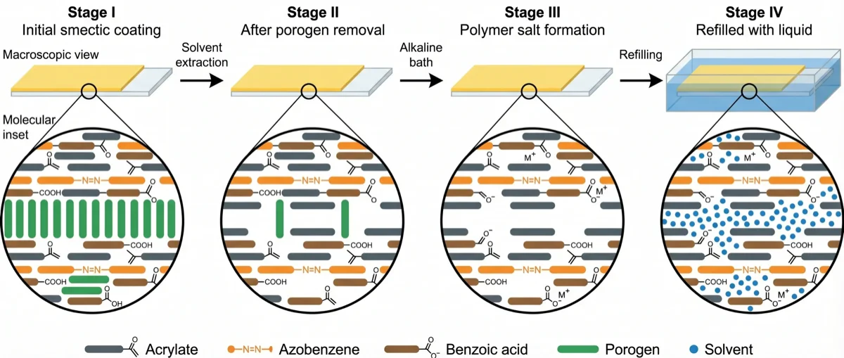
A four-stage left-to-right diagram of a liquid-crystal-network coating as it is chemically converted. Each stage shows two things: a macroscopic view of a thin yellow coating on a glass slide (with a small zoom marker), and a molecular inset below it showing the mesogen arrangement. Stage I "Initial smectic coating" shows a pristine polymer film with ordered stacks of rod-shaped mesogens (acrylates, azobenzenes, benzoic acid units, and porogen fillers) arranged in neat smectic layers. Stage II "After porogen removal" — connected by an arrow labelled "Solvent extraction" — shows the same film minus the porogen rods, leaving gaps. Stage III "Polymer salt formation" — connected by "Alkaline bath" — shows the benzoic acid groups converted to charged benzoate salts. Stage IV "Refilled with liquid" — connected by "Refilling" — shows the film immersed in a solvent bath with small solvent molecules filling the voids. A small legend at the bottom identifies each mesogen type. Style: flat, editorial, Nature-journal aesthetic. Composition and palette are up to the agent.
Scientific illustrations FigCanvas can create
From molecular pathways to experimental schematics, FigCanvas helps researchers create clear, structured scientific visuals across many figure types.
Cell Biology Diagrams
Create labeled figures of organelles, membranes, mitosis, intracellular transport, and cellular structure.
Signaling and Pathway Diagrams
Visualize signaling cascades, pathway nodes, molecular interactions, and regulatory relationships in a clean scientific layout.
Molecular Mechanisms
Illustrate gene editing, protein interactions, enzyme catalysis, receptor activation, and other mechanistic processes.
Anatomy and Medical Figures
Create simplified medical and biological illustrations for education, research communication, and scientific storytelling.
Lab and Experimental Schematics
Show study concepts, assay setups, sample workflows, and experimental logic with structured scientific visuals.
Custom Scientific Illustrations
Create visuals for unique research ideas, figure concepts, workflows, and scientific scenarios beyond these common examples.
How FigCanvas works
Go from prompt to editable scientific illustration in three steps.
Describe your scientific figure
Write a plain-language prompt describing the pathway, molecular mechanism, cell biology process, or scientific concept you want to illustrate.
Generate a structured illustration
FigCanvas turns your prompt into a clean scientific figure with layout, labels, and visual structure designed for research communication.
Refine, vectorize, and export
Export your illustration as PNG or PDF directly, or convert it to an editable SVG to adjust labels, colors, and layout before final export.
Why FigCanvas creates better scientific illustrations
Trained on real scientific figures
FigCanvas is built on large-scale visual training from hundreds of thousands of real scientific figures, including styles commonly seen in top-tier journals. This helps generate illustrations with appropriate composition, visual hierarchy, and scientific figure conventions.
Optimized for journal-style illustration
Unlike generic image tools, FigCanvas is designed for scientific illustration workflows, with color, layout, and content structure better aligned with the needs of research figures, pathway diagrams, and mechanism illustrations.
Editable as vector graphics
Convert generated figures into editable vector graphics, so you can refine details, update labels, and adjust layout before finalizing your scientific illustration.
Export-ready for research communication
Export your scientific figures as SVG, PNG, or PDF for manuscripts, posters, presentations, grant slides, and other research workflows.
Scientific illustration for papers, posters, and presentations
From manuscript figures to conference slides, FigCanvas helps you create illustrations that explain research more clearly across different workflows.
For research papers
Create scientific figures, pathway diagrams, and mechanism illustrations that communicate your findings clearly in manuscripts and preprints.
For grant proposals
Use scientific illustrations to visualize biological models, study rationale, experimental concepts, and pathway hypotheses in funding applications and project plans.
For posters and presentations
Turn complex pathways, molecular mechanisms, and biology concepts into clear scientific illustrations for posters, conference talks, seminars, and lab meetings.
For teaching and scientific communication
Create simple, structured illustrations to explain biological processes, experimental workflows, and research ideas to collaborators, students, or broader audiences.
Scientific Illustration FAQs
Scientific illustration software helps researchers create scientific illustrations and figures that explain biological structures, molecular mechanisms, pathways, experimental concepts, and other research ideas visually.
FigCanvas can help create pathway diagrams, cell biology illustrations, molecular mechanism figures, lab schematics, and other scientific illustrations for research communication.
Yes. FigCanvas can generate scientific illustrations for pathway diagrams, mechanism-based research figures, and study schematics from a plain-language prompt.
FigCanvas is built specifically for scientific illustration. It uses research-specific visual training informed by real scientific figures, helping generate illustrations with structure, composition, and styling that are better aligned with scientific communication than generic design tools.
Yes. FigCanvas can convert generated scientific illustrations into editable vector graphics, making it easier to refine labels, adjust layout, and prepare the figure for final use.
You can export your scientific illustrations in SVG, PNG, or PDF format for manuscripts, posters, slides, grant proposals, and other research workflows.
Start creating scientific illustrations today
Generate pathway diagrams, cell biology figures, and mechanism illustrations from plain-language prompts. No design skills required.